Probably, each react developer encountered with non effective documentation for different libraries. And spent a lot of time to achievement desired result.
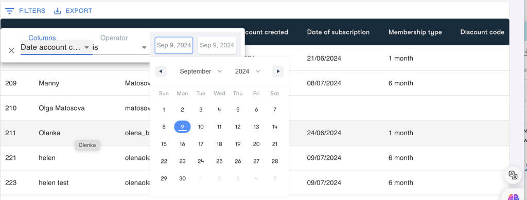
In this article, I will guide you through the process of adding a custom DateRange component into the MUI DataGrid, allowing users to filter by date ranges. We’ll be using the DateRange component from the react-date-range library and integrating it into the DataGrid’s column settings
Step 1: First, ensure you have the required libraries installed in your project. You’ll need both MUI DataGrid and react-date-range
npm install --save @mui/x-data-grid react-date-range
Step 2: Create DateFilterComponent and import DateRange and styles into your component:
Your custom date range filter component should handle how the date filter is displayed and function.
import 'react-date-range/dist/styles.css'; // main style file
import 'react-date-range/dist/theme/default.css'
import { DateRange } from 'react-date-range';
<DateRange
editableDateInputs={true}
onChange={handleFilterChange}
moveRangeOnFirstSelection={false}
ref={dateRangeRef}
ranges={state}
/>Also for formatting dates let’s setup datajs
npm install dayjsimport * as dayjs from 'dayjs';
import 'react-date-range/dist/styles.css'; // main style file
import 'react-date-range/dist/theme/default.css';
import { DateRange } from 'react-date-range';
export function DateFilterComponent(props) {
const { item, applyValue } = props;
const [state, setState] = useState(
[
{
startDate: new Date(),
endDate: new Date(),
key: "selection"
}
]);
const dateRangeRef = useRef(null);
const handleFilterChange = (value) => {
applyValue({
...item,
value: `${dayjs(value.selection.startDate).format("DD-MM-YYYY")}/${dayjs(value.selection.endDate).format("DD-MM-YYYY")}`
});
setState([value.selection]);
};
return(
<DateRange
     editableDateInputs={true}
     onChange={handleFilterChange}
     moveRangeOnFirstSelection={false}
     ref={dateRangeRef}
     ranges={state}
/>
)
}Key Concepts:
- Importing Dependencies:
- The code imports
dayjsfor date manipulation and formatting. - Stylesheets for
react-date-rangeare imported to ensure the component displays correctly.
- The code imports
- Component Structure:
- The component receives
itemandapplyValueas props, which are used to apply the selected date range filter. useStatemanages the selected date range, initializing bothstartDateandendDateto the current date.useRefcreates a reference to the DateRange component, allowing for direct interaction with the date picker.
- The component receives
- Handling Date Selection:
- The
handleFilterChangefunction formats the selected date range usingdayjs, applying it in the “DD-MM-YYYY” format. - This function also updates the component’s state with the new date range whenever the user makes a selection.
- The
- Rendering the Date Range Picker:
- The
DateRangecomponent fromreact-date-rangeis rendered with the ability to edit the date inputs. - The selected date range is displayed and updated as the user interacts with the picker.
- The
This component integrates a date range filter in a custom way, making it a valuable addition for implementing advanced filters in MUI DataGrid.
Step 3: Set up filterOperators for the date column: The filterOperators prop allows you to customize the operators for a specific column. You will apply the date filter operators using getGridDateOperators() and integrate it with the custom DateFilterComponent
  const columns = [
      {
        field: "created_at",
        headerName: "Date account created",
        type: "date",
        filterOperators: getGridDateOperators()
          .filter((operator) => operator.value == "is")
          .map((operator) => {
            return {
              ...operator,
              InputComponent: DateFilterComponent,
              InputComponentProps: { type: "date" },
            };
          }),
      }
    ];
<DataGrid
columns={columns}
rows={membersList}
onSortModelChange={onSortChange}
slots={{
toolbar: CustomToolbar,
}}
/>